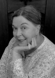
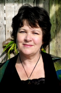
 Fiona Sinclair, author, illustrator, designer, creator, chats to Reading Time reviewer, Maura Pierlot, about her new children’s book, Type has a body … Just like you!, published by Butterfly Publishing.
Fiona, I’ve never seen a children’s book on typography! Why write a children’s book on fonts? Tell us how this book evolved, from concept to publication.
My book began with a drawing of two characters that I made out of fonts. I used fonts from the Minion Pro typeface to create Minnie and fonts from the Impact typeface to create Ivan. These two characters triggered an idea for a book for early learners to find out more about letterforms and typefaces. I worked with rhyme and humour to develop the factual text, and developed the characters as small flip book illustrations on each page so that children could see how the letterforms were used to build Minnie and Ivan and have fun flipping the pages of the book to create the animation. I made an additional resource as a free download with lots of fun exercises for children to do. This was to help consolidate the information in the book and provide the visual learners with activities to engage with.
I sent a draft of my book to two of my favourite typographers and both were very positive in their feedback. I also sent a draft to an initial teacher educator at university, and she was very excited about the content. With this feedback I felt encouraged to continue and then pitched the idea to a publisher who creates inclusive Children’s Books and Resources to support children in learning. She liked the humour, rhyme and connection between letterforms and the body and was interested in working together to get my book off the ground.
Your book cleverly relates fonts and their names to the human body. Where did this creative inspiration come from, and what was the greatest challenge in undertaking this project?
In my role as a Resource coordinator for a design teacher’s organisation, I have made many resources to teach secondary school children about typography. The one recurring theme that appears when you look at the anatomy of a typeface is the reference to the body. Letterforms have eyes, necks, legs, arms and shoulders. I thought that this correlation would be interesting to share with primary school age children who are learning about their body, and also learning to read and write. The use of rhyme is a fun challenge for an author, and although some book publishers are wary of authors using rhyming text, I think that it can make a story flow which makes it pleasant to read and easy to remember.

How can understanding typography help children with language, reading and writing skills?
Letter recognition is an important first step in learning to read and write. This is why I think that it is crucial that children begin to explore different fonts and typefaces. Understanding the structure of letterforms and identifying different typefaces may influence both the legibility of the text and the motivation of children to read it. A densely leaded body of text, where the lines are too closely packed together, will easily disengage a reader. Font selection and an understanding of this will enable children to engage with texts and produce written content that will be read by others.
What do you hope that children take away from your book?
I hope that children are excited to learn more about the meaning behind the typefaces that they see and use every day. My book aims to teach children about the structure of a letterform and how each stroke and serif adds personality and meaning to the typeface.
If children develop the skills to carefully consider the typefaces that they choose when working on a computer, hand lettering a poster or making cards for friends then they will learn to love letters and understand the power of type.
What do you believe makes a good book for children?
I think that a good non-fiction book for children is original and inspiring and encourages the reader to want to learn more about the topic. A book needs to foster enquiry and creativity and take the reader to a place that is interesting, exciting and unfamiliar. With fiction books I think that children need to be taken on a journey that is enlightening and uses visual metaphors to help unpack and demystify life and also take them on a journey of discovery and imagination.
Your website (fionasinclairdesign.com.au) states: ‘I am a designer who likes to blur the lines between illustration and design.’ How long have you been doing this, why and how?
I have been illustrating, designing and making art for over thirty years. My background as an art and design teacher has allowed me to share my passion with students and, in return, be inspired by the work that they do. When teaching a unit on Digital Typography to graphic design students, I was exploring the Adobe software, Illustrator, and this led me to develop an entire alphabet of Australian plant inspired letters. I not only learnt how to use the software and pass these skills on to the students, but I named my alphabet Typotany, had it printed on linen tea towels locally and sold them to a range of retail outlets. The individual letters were printed and exhibited at a gallery in Castlemaine and also in Melbourne where I did an artists’ talk about the process. From teaching to illustration to fine art – There is a lot of overlap in the work that I do.
You’re a busy creative, working on your own stationery and homewares designs, while undertaking other work in design and education. Does each of these interests come with its own rewards and challenges? Which one allows you to best pursue your passion?
My passion is to create projects. I love design, typography, illustration, embroidery and writing – so there are many things to work with. When I completed a Masters of Creative Arts, I was required to develop a written body of work and a visual body of artworks for exhibition. I found that writing and creating visual art followed the same design thinking processes. As I researched and explored my topic, this inspired a written response, which lead me to create a visual response, which led me back to researching and writing, and in turn, creating more visual art. It was through this process that I realised that making and creating was not limited to visual fields. I was inspired to write, draw, construct, sew, collage and use a range of creative means to express an idea. The one constant is working with original ideas to express a thought and unravel its meaning. My passion is to work across multiple fields to reach a creative outcome. All of my interests and work seem to overlap and allow me to pursue this passion.
What has been the most valuable piece of advice you’ve received in your creative career?
My daughter has always reminded me that she was never allowed to use clip art or copy text or base an artwork on another person’s idea when she was at Primary school. She was constantly reminded (by me) that if the strength of her work was what she had taken from someone else, then there was no strength in your own idea. Be original, honest and work until the idea is as fully resolved as you can make it. This is the work ethic that I admire most in others.
What advice would you give to aspiring young creators, whether graphic designers, artists or writers?
I would say to aspiring creators to always make time for your art. Spend more of your time, energy and focus on your creative pursuits and don’t let mundane things and distractions get in the way. I think that it is important to do what you enjoy – learn from others and develop your skills and your own personal style. Create opportunities, collaborate with others and just focus on the work.
What are you working on now? What’s next?
Inspired by Tiago Pinto who believes that ‘every font has a face’ I am working on writing and illustrating a children’s book of type face portraits. I’d like to encourage children to have fun with type and create portraits using letterforms – further exploring and understanding the personality of a typeface. As a hobby I have become a little obsessed with finding and photographing butterflies in my local area with my husband – identifying them by their location, colour, patterns and flying characteristics. I have an illustrated book for children on butterflies fluttering around in my head ready to emerge from its cocoon. I am working on my water-colour painting and digital illustration techniques to push them in different directions that are less controlled and more fluid and fleeting. My life is a whole lot of creative works in progress. Lucky my husband likes to cook!
Lastly, I can’t resist asking: What is your favourite (go-to) font? Which font do you deplore, and why?
Futura is a favourite – a great retro-futuristic font. It is geometric but elegant. It has been used in many forms in logos, advertising and films. The Futura font was used on the plaque that was left on the Moon in the Apollo 11 mission. But not good for all occasions. I initially wrote Type has a body…Just like you! in Futura and sent my draft to the director of the Australian Type Foundry, for feedback. He was very positive about the book concept but had one criticism that the Futura body text felt a tiny bit aggressive. Not wanting to appear at all aggressive, I researched friendly fonts and found that there were many fonts that were not only friendly, but also more legible for children with dyslexia to read. So with the feedback from an expert, and a click of the mouse, the body text font was made friendly.
Read a review of Fiona’s book, Type has a body here.


